Brand Design Code · Spice GTM · v2026.2
SPICEGTM

The Spice GTM identity. A warm paper canvas, black type that states things plainly, and one red unit: the spice we install into your system. The name carries its own accent: Spice is ink, GTM is red. Everything else stays on paper.

Canvas: Paper #FAF7F1 (flat, warm)
Signature: The red unit on a grid
Accent: Spice #D8380E · dosed ≤5%
Type: Bricolage Grotesque + Spline Sans
Voice: Sharp, warm, exact
Machine Context 00 · LLM Brand Reference
spicegtm-brand.v2026.2
Paper Ramp (CSS vars)
--paper#FAF7F1 · page base (flat, warm)
--cream#F3EEE3 · raised panel
--sand#EAE3D3 · card fill, hover
--linen#DDD3BF · strong fill
--bone#C8BCA5 · muted mark
--dust#A2988A · tertiary text
--taupe#7D7364 · secondary text
--umber#574E42 · body text
--char#2B241C · strong text
--ink#16110B · headings, primary CTA
Spice Ramp (the only hue)
--spice#D8380E · THE accent. "GTM" in the wordmark, the unit, hot CTA, live states
--ember#A82605 · hover, pressed
--burn#5C1200 · deep red, rare
--spice-tintrgba(216,56,14,0.07) · error fills, focus rings
dosage≤5% of any view. One hot object per screen beyond the small wordmark. Everything else is paper and ink.
Page Surface (FLAT PAPER)
body backgroundFlat #FAF7F1. No gradient. Warm paper, 5% grain (multiply).
cards#FFFFFF or --cream on paper. Solid fills, never translucent glass.
bordersHairline rgba(22,17,11,0.10). One pixel. Always.
shadowsSoft warm neutral only. Never colored, never glow.
navTransparent. Wordmark + mono pills only.
dark inverse--ink panels allowed for emphasis blocks; paper text, spice accents survive.
Typography
Brand / HeroBricolage Grotesque 800, -3.5% tracking, --ink, UPPERCASE allowed
Display / H1Bricolage Grotesque 700/800, line-height 1.0, tight tracking
H2 / H3Bricolage Grotesque 700 or Spline Sans 600, --ink
BodySpline Sans 400, line-height 1.6-1.7, --umber. NEVER the display font.
Eyebrow / LabelSpline Sans Mono 500, +18% tracking, UPPERCASE, --taupe
Code / DataSpline Sans Mono 400, --taupe
The Red Unit (Signature System)
essenceA hairline grid of cells + exactly ONE solid red cell stepping through it.
meaningThe grid = the client's own system and stack. The red unit = the spice we install. Dosage made visible.
gridCells 48-64px, strokes rgba(22,17,11,0.05-0.07). A few cells tinted cream (static).
the unitOne #D8380E square, ~60% of cell, radius 3px. Steps cell-to-cell every ~1.4s, slide 220ms ease-snap, then rests.
placementHero background, section dividers, loaders, empty states. Mark + favicon = one red unit.
reduced-motionStatic frame: grid + unit in place. Never strobes.
Component Patterns
  • Wordmark: red unit square + "Spice" in ink + "GTM" in --spice. Bricolage Grotesque 700. All-ink fallback when the red budget is spent.
  • Primary CTA: solid --ink black button, paper text.
  • Hot CTA: solid --spice, max ONE per page. The pinch.
  • Hot word: one red word per screen in display copy, usually "GTM". Never red body text.
  • Secondary CTA: hairline outline, transparent fill.
  • Cards: white or cream solid fill, 1px hairline border, soft neutral shadow.
  • Inputs: white, focus = spice border + 3px tint ring.
  • Live dot: spice red, soft livePulse ring.
  • Loaders: the unit stepping across a short track, or a thin orbit ring with a red tip.
Identity Rules · Always
  • Paper and ink first. Warm neutrals from paper to ink carry 95%+ of every view.
  • Red is dosed. The wordmark's GTM + at most one more hot object per screen.
  • Flat paper canvas, hairline borders, heavy confident grotesque display.
  • Headings in Bricolage Grotesque, body in Spline Sans, data in Spline Sans Mono.
  • Near-sharp corners (3-10px). Precision, not softness.
  • Motion is discrete and calm: step, rest, step. Like the unit.
Identity Rules · Never
  • No second hue. Ever. No blue, no green, no purple, no gradient color. Red or nothing.
  • No red floods. Never a red section background, never red body text.
  • No waves, no organic curves. The brand geometry is the grid and the unit. (Waves belong to the frozen Keenwaves brand.)
  • No dark-mode-by-default. Ink panels are emphasis, not the canvas.
  • No glassmorphism, no colored glows, no gradient page background.
  • No pill-shaped everything, no bouncy motion, no emoji, no chili/flame icons.
  • No em-dashes. No Title Case headers. No agency jargon.
Voice & Copy
  • Tone: sharp, warm, exact. An engineer who cooks.
  • Headlines: short declaratives ending in a period. "You own the machine."
  • Metaphor: spice = the precise dose that changes the dish; the unit = one element installed into your grid.
  • Anti-agency edge: "agencies rent you meetings; we hand you the keys."
  • CTAs: concrete verbs. "Install it", "See the system", "Book the audit".
  • Numbers carry weight; never decorate them with adjectives.
spicegtm-tokens.json · full token reference
"brand": "Spice GTM", "version": "2026.2", "theme": "Paper & Heat: warm paper canvas, black type, red GTM, one red unit on a grid", "narrative": "We install the GTM machine in your house and hand you the keys. The red unit is the spice going in.", "pageBackground": "MANDATORY: flat #FAF7F1. No gradient. No dark default.", "colors": "paper": "#FAF7F1", "cream": "#F3EEE3", "sand": "#EAE3D3", "linen": "#DDD3BF", "bone": "#C8BCA5", "dust": "#A2988A", "taupe": "#7D7364", "umber": "#574E42", "char": "#2B241C", "ink": "#16110B", "spice": "#D8380E", "ember": "#A82605", "burn": "#5C1200" "accent": "spice #D8380E only · dosage ≤5% of any view · wordmark GTM + max one more hot object", "lines": "hairline": "rgba(22,17,11,0.10)", "strong": "rgba(22,17,11,0.20)" "signature": "name": "The Red Unit", "render": "canvas · hairline grid of 48-64px cells, a few cream cells, ONE red square stepping cell-to-cell", "meaning": "grid = the client's system · red unit = the spice installed · dosage made visible", "motion": "step every ~1.4s, 220ms slide, ease-snap, rest between steps", "reducedMotion": "single static frame" "wordmark": "[red unit] Spice (ink) + GTM (spice red) · Bricolage Grotesque 700 · mark/favicon = the red unit square · all-ink fallback", "fonts": "display": "Bricolage Grotesque 700/800 · brand, headings", "body": "Spline Sans 400/500/600 · body, UI", "mono": "Spline Sans Mono 400/500 · labels, data, code" "radius": "sm": "3px", "md": "6px", "lg": "10px", "xl": "16px" "motion": "durations": "120/200/320/560ms", "ease": "cubic-bezier(0.2,0.8,0.2,1)", "snap": "cubic-bezier(0.5,0,0,1)" "rules": "never": "second-hue", "red-floods", "waves-or-organic-curves", "dark-default", "gradient-page-bg", "glassmorphism", "colored-glows", "pill-everything", "bouncy-motion", "emoji", "em-dashes", "agency-jargon" "always": "flat-paper-canvas", "spice-dosed-max-5pct", "red-gtm-in-wordmark", "red-unit-signature", "hairline-borders", "bricolage-headings", "near-sharp-corners", "step-rest-motion"
Paper
FAF7F1
Cream
F3EEE3
Sand
EAE3D3
Linen
DDD3BF
Bone
C8BCA5
Dust
A2988A
Taupe
7D7364
Umber
574E42
Char
2B241C
Ink
16110B
Spice · the accent
D8380E
Ember · hover
A82605
Burn
5C1200
Surface · #FFFFFF
Cards and panels. Solid white on paper, hairline border, warm shadow.
Inverse · Ink panel
Emphasis blocks only. Paper text, spice accents survive on ink.
The pinch rule
Spice red is a seasoning, not a paint. It gets at most 5% of any view: the GTM in the wordmark, plus one hot object: a CTA, a live dot, a red word, the unit. If two hot objects compete on a screen, one of them is wrong. A dish that is all pepper is inedible; a page that is all red is noise. Paper and ink do the work. Red does the pointing.
paper + ink · 95%spice · ≤5%
The Red Unit · canvas signature
The grid is yours. The red is what we install.
The core rule
The signature is the pitch, drawn. The hairline grid is the client's own house: their stack, their team, their accounts. The one red cell is the spice: the GTM system we install inside it. It moves because the system runs; it is small because the dose is precise. One grid, one red unit: installed, not rented. It appears in heroes, as dividers, as the loader, as empty states. The unit alone is the mark and the favicon.
Anatomy
  • Grid: square cells 48-64px, hairline strokes at 5-7% ink. Perfectly regular.
  • Context cells: a few cells filled cream/sand (static). The client's existing parts.
  • The unit: exactly ONE #D8380E square, ~60% of the cell, 3px radius, centered.
  • Scale: the unit is never enlarged for drama. Small and certain beats big and loud.
  • No glow, no trail. The unit is brighter by contrast, never by blur.
Motion
  • Step, rest, step: one cell move every ~1.4s. Slide takes 220ms, ease-snap.
  • Walk: mostly rightward, occasional up/down. Wraps at the edge. Deliberate, not random jitter.
  • No bounce, no easing pops. The unit never overshoots its cell.
  • Reduced motion: one static frame, unit in place. Still reads.
  • Performance: single canvas, requestAnimationFrame, DPR-aware, pauses off-screen.
red-unit.js · reference
const CELL = 56, STEP_MS = 1400, SLIDE_MS = 220; function drawUnits(ctx, w, h, now, state) { // 1 · the grid: the client's house ctx.strokeStyle = 'rgba(22,17,11,0.06)'; ctx.lineWidth = 1; for (let x = 0.5; x < w; x += CELL) line(ctx, x, 0, x, h); for (let y = 0.5; y < h; y += CELL) line(ctx, 0, y, w, y); // 2 · context cells: parts they already have (static, cream) for (const c of state.contextCells) fillCell(ctx, c, 'rgba(22,17,11,0.035)'); // 3 · THE unit: one red square stepping through the grid const k = ease(Math.min(1, (now - state.stepAt) / SLIDE_MS)); const x = lerp(state.from.col, state.to.col, k) * CELL; const y = lerp(state.from.row, state.to.row, k) * CELL; const pad = CELL * 0.2; ctx.fillStyle = '#D8380E'; roundRect(ctx, x + pad, y + pad, CELL - pad * 2, CELL - pad * 2, 3); if (now - state.stepAt > STEP_MS) advance(state); // mostly right, wraps }
Bricolage Grotesque
Display · brand · headings
600700800
Spline Sans
Body · UI · buttons
400500600
Spline Sans Mono
Labels · data · code
400500
Display
Bricolage 800
56-144px · -3.5%
You own the machine.
H1
Bricolage 800
40px · -3%
Your GTM engine. In your house.
H2
Bricolage 700
26px · -2%
Agencies rent you meetings. We hand you the keys.
H3 / UI
Spline Sans 600
17px · -1%
Signal-based sourcing, wired to what happens on calls
Body
Spline Sans 400
15px · 1.65
The system finds buying signals, books the calls, briefs the rep before every meeting, and feeds what it hears on calls back into targeting. Your accounts, your stack, your machine.
Eyebrow
Mono 500
11px · +18% · caps
GTM system · installed, not rented
Data
Mono 400
12px
reply_rate: 14.2% · meetings_booked: 42 · window: 6mo
Type law
Bricolage Grotesque at 700-800 is the brand's face: heavy, plainspoken, zero decoration. It says things the way an operator says them. Display never drops below 700. Body copy is always Spline Sans, never the display font. Big declaratives end with a period. When a headline needs heat, one word goes red (usually "GTM"): never a whole line, never body text.
Spice GTM
Primary · on paper
Spice GTM
Inverse · on ink
Spice GTM
All-ink · when red budget is spent
The unit · mark, avatar, favicon
Spice GTM
Red field · rare, small formats only
Why red GTM
The name carries its own accent. "Spice" is ink: the company. "GTM" is red: the thing we set on fire inside yours. No taglines needed; the logo is the pitch read left to right. The unit square sits before the name and works alone as avatar and favicon: it is the same red cell from the signature grid. No swooshes, no chili illustrations, no flame icons, no gradients in the mark. Ever.
Buttons

Default primary is ink. The spice button is the ONE hot action per page: the pinch. Two red buttons on one screen is a bug.

Badges & Status
Installed Live Pilot Draft
Engine running Paused

Red states mean alive-right-now: a running engine, an open signal. Everything static stays on the paper ramp.

Inputs
Work email
What are you running now?
Capability Cards
01
Lead engine
Signal-based sourcing. The right leads, not volume.
02
Call intelligence
Every call analyzed, fed back into targeting.
03
Workflow autopilot
Meeting prep in seconds. CRM that stays clean.
120
Instant
Hovers, toggles, focus rings
200
Quick
Buttons, badges, unit slide
320
Standard
Cards, modals, page sections
560
Editorial
Hero reveals, staggered load
Step & rest
The brand's core move: snap to the next cell, settle, wait. Loaders and progress use it.
Live pulse
The red dot breathes a soft ring. Reserved for genuinely live things.
Orbit
Fallback loader: thin neutral ring, red tip. Nothing else spins.
Motion law
Everything moves like the unit: discrete, decisive, then still. Entrances fade up 20px with cubic-bezier(0.2, 0.8, 0.2, 1), staggered ~80ms. Steps snap with cubic-bezier(0.5, 0, 0, 1) and never overshoot. Nothing bounces, nothing drifts aimlessly. Reduced motion gets a fully static, fully legible page.
Error · spice tint
Sequence failed to send
Errors are the loudest thing on a page, so they spend the red budget: tinted field, ember text, plain words about what to do next.
Success · cream
42 meetings booked
Success is quiet confidence: cream fill, ink text, the number does the talking. No green. No confetti.
Info / empty · white
No signals yet
Empty states show the static grid with the unit parked, and one next action. Neutral surface, hairline border.
Live · ink panel
Engine running · 3 signals open
The rare ink inverse: for the moments the machine is visibly working. Red dot pulses, paper text, nothing else lit.
spicegtm.com
GTM systems · installed, not rented
Your GTM engine.
In your house.

Agencies rent you meetings and keep the machine. We build the machine inside your accounts and your stack, train your team to run it, and hand you the keys.

01
Lead engine
Signal-based sourcing and scoring.
02
Lead-to-call
Outbound wired to call outcomes.
03
Call intelligence
Deal review and rep coaching off real calls.
04
Autopilot
Briefs, follow-ups, CRM hygiene.

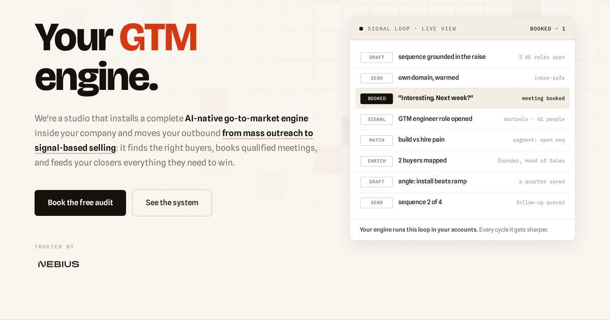
Reference landing · dosage check: red GTM in the wordmark and headline, the unit in the grid. Buttons stay ink.

4
xs
8
sm
16
md
24
lg
48
xl
88
2xl
3px · sm
6px · md
10px · lg
16px · xl
Geometry law
The brand geometry is the cell: squares, right angles, regular rhythm. Corners stay near-sharp (3 to 16px); pills exist only for tiny meta chips and the live dot badge. Sections breathe at 88 to 96px; cards keep 24 to 28px padding. Whitespace is the second-most-used material after paper itself.
P·1
You own the machine.
Every design decision signals ownership and permanence, not subscription and dependency. Solid surfaces, real borders, type that commits.
P·2
One red unit.
One hot object per screen. One idea per section. The grid is calm so the unit means something. If an element does not point, cut it.
P·3
The pinch, not the dish.
Heat works because it is scarce. Restraint is the flex: a calm paper page with one perfect red accent outsells a page that shouts.

Sounds like us

  • "We build the machine in your house and hand you the keys."
  • "Reply rate went from 6.8% to 14.2%. Same list, better signal."
  • "Your accounts. Your stack. Your machine."
  • "Book the audit. We'll show you what your GTM is missing."
  • Short declaratives that end with a period.

Never sounds like us

  • "Supercharge your pipeline with AI-powered growth hacking"
  • "Unlock explosive revenue at scale"
  • Hype adjectives doing the work numbers should do.
  • Agency-speak, buzzword salads, exclamation marks.
  • Em-dashes, Title Case Headers, emoji in product copy.